One clear action
Every section points to the same place: apply now, or get the app. No dead ends and no competing buttons.
The easiest financing, without the hassle: a fast, bilingual front door for a consumer-finance brand.
01 / 14 · Custom Web App
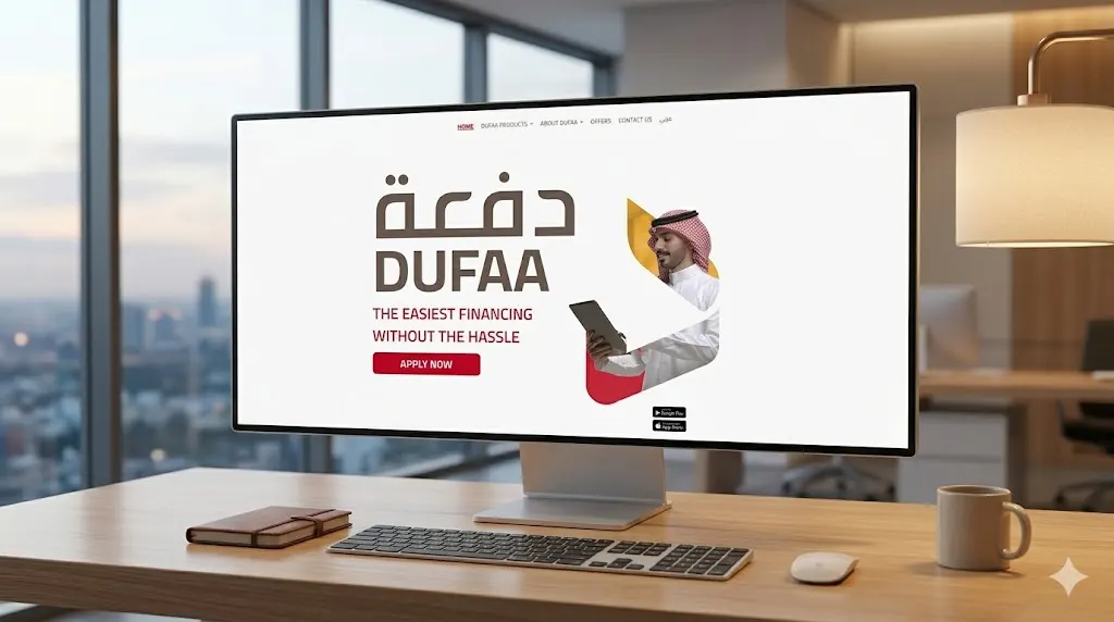
Dufaa (دفعة) makes consumer financing simple, and its website had to say so in seconds. The brief: a landing experience that loads instantly, explains each finance product without jargon and moves visitors towards one of two actions, apply now or download the app.
We designed a bold, confident homepage around the brand's red-and-sand palette and Arabic wordmark: one "Apply now" action above the fold, product and offer sections below, and store badges wherever intent is highest. Interactive touches make the page feel alive without weighing it down.
A lightweight, high-performance landing page with interactive elements to showcase their services.
Every section points to the same place: apply now, or get the app. No dead ends and no competing buttons.
English and Arabic share one design system, so switching language keeps layout, rhythm and hierarchy intact.
Motion and hover states are hand-tuned and lightweight, so the page stays quick on everyday phones.
Products, offers and company pages sit on reusable sections, so a new product launches without a redesign.
Mapped the products, the audience and the two actions that matter.
Bilingual layout grid, content hierarchy and a red-accent UI kit.
Lightweight build, tuned motion and cross-device QA.
Launch, speed checks and handover.
Tell us about your project. We'll show you how we'd approach it, with a free consultation and a project plan within 48 hours.